It’s funny how you don’t think about accessibility issues. At least I didn’t until Key Evoy (of Solo Build It!) brought it to my attention about a week ago.
So what is it? Well, I never gave thought to my red links and lightish-grey text, over on my Easy Food Dehydrating website. I thought it “looked neat.” You know, all modern and everything. But in the end, it doesn’t matter what I think. It’s what my readers SEE that matters.
Trendy styles don’t always equate to positive website results. You can have the most beautiful website (design) in the world, but if folk can’t tell a link from a word, then you’re in trouble. Accessibility to all folks, matters.
Color Blindness Accessibility Problem
Many people see red as black, so for the food dehydrating site, my links would not pop out at them … they’d just see text. So what did I decide to do?
For the sake of accessibility, I changed all the red links to simple black text (and made the body text black also) and used a simple underscore as the link “signal.” Yep. Nothing earth-shattering there, but boy, what a difference it makes.
Create Links That Mean Something For Accessibility
Another thing that needed sorting out for the sake of accessibility, and it probably pertains to my posts on Supabees too, is to create links that mean something.
How many times have you seen a link worded like this: “For more on xxxx Click HERE” and all that is linked is the word “HERE.” For those that have software that reads links, the word HERE actually tells them zip.
Create Contrast To Minimize Accessibility Issues

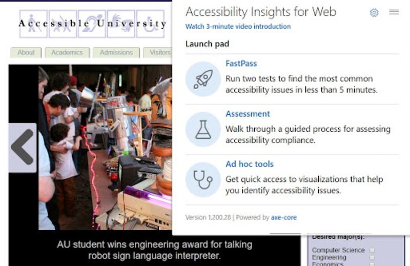
There’s a great extension called “Accessibility Insights for Web.” The Chrome extension actually pulls up your website pages and shows you where you’re going wrong. Just look at all the red-flagged areas in the example above.
Boy oh boy, was I ever in pain when just about “everything” at the food dehydrating site was flagged as being inaccessible – accessibility-wise.
It brought low-contrast areas to my attention. I’ve just finished the mammoth task of fixin’ it. Now onto the next site to fix …


